André
Alicia André
About
Alicia André
About
01
Alien
2019
Experimental Typography
02
Doomsday Clock
2019
Editorial Design
03
Midas
2019
Poster Design
04
DIV
2019
Global Branding
05
American Psycho
2019
Poster Design
06
Just Dope It
2018
Photography & Video
07
Moëlle
2018
Editorial Design
08
Stigmates
2018
Global Design
09
1F
2017
Bachelor Project
10
Veni, Vedi, Persisti
2016
Photographic Editorial Design
×
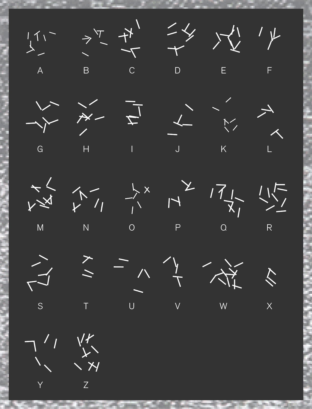
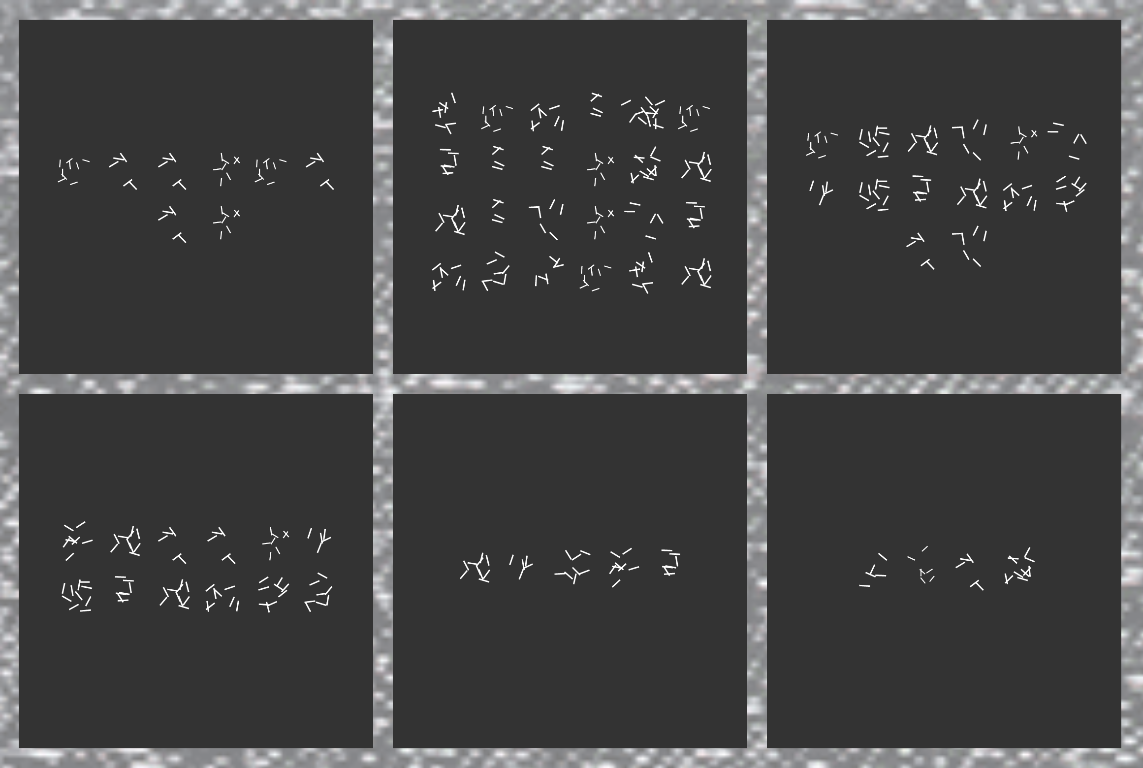
01
Alien
Creation of an experimental typeface inspired by one of humanity's oldest dreams : interstellar communication. I developed a visual system of typographic deformation using the sound captured near the planets of the solar system by the Voyager probes. Pretending that we have received an Alien transmission, I created a web-based interface to interpret this new form of language and visually communicate thanks to this fake Alien alphabet.
Website
×
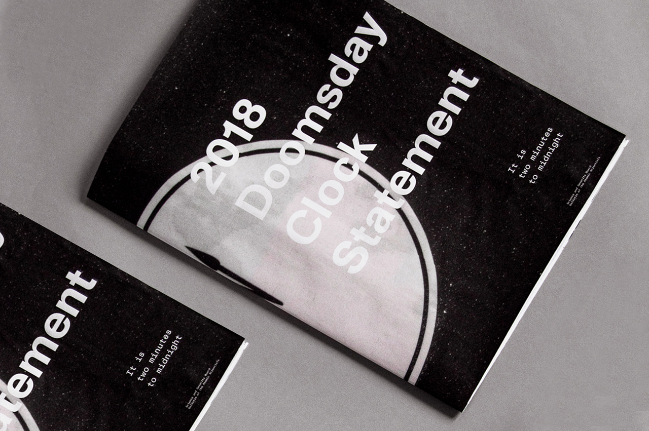
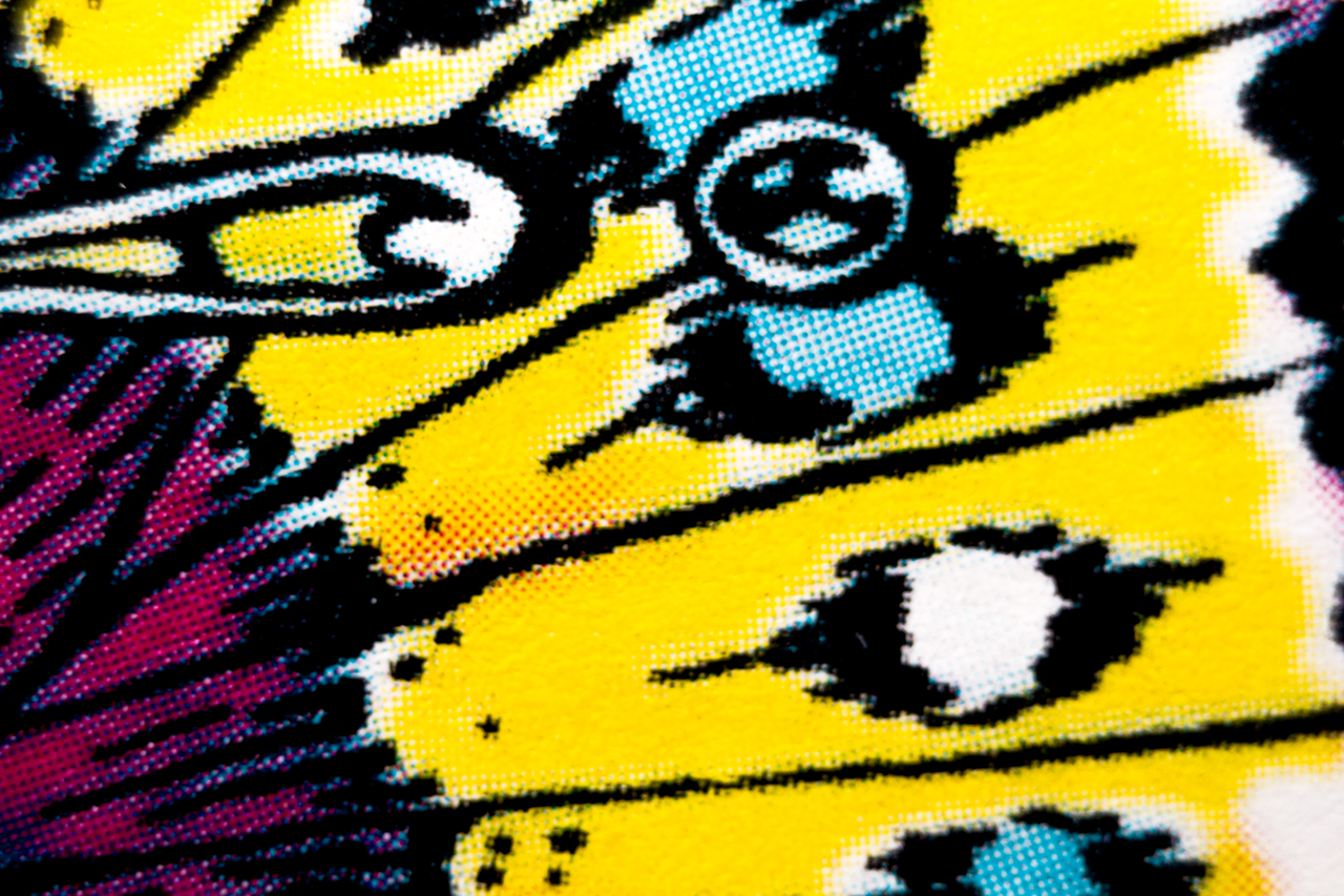
02
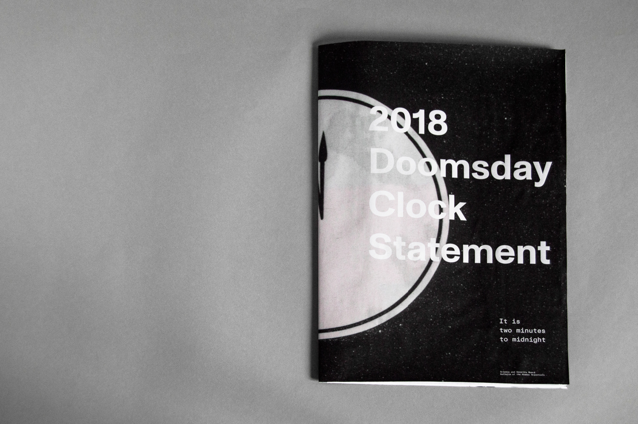
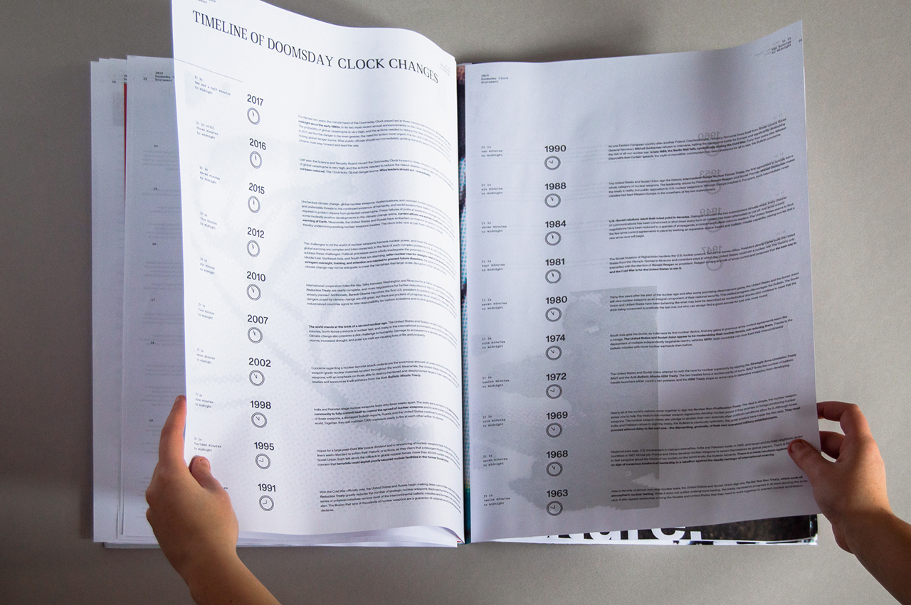
Doomsday Clock
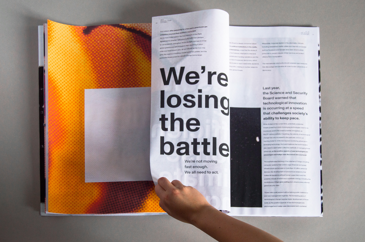
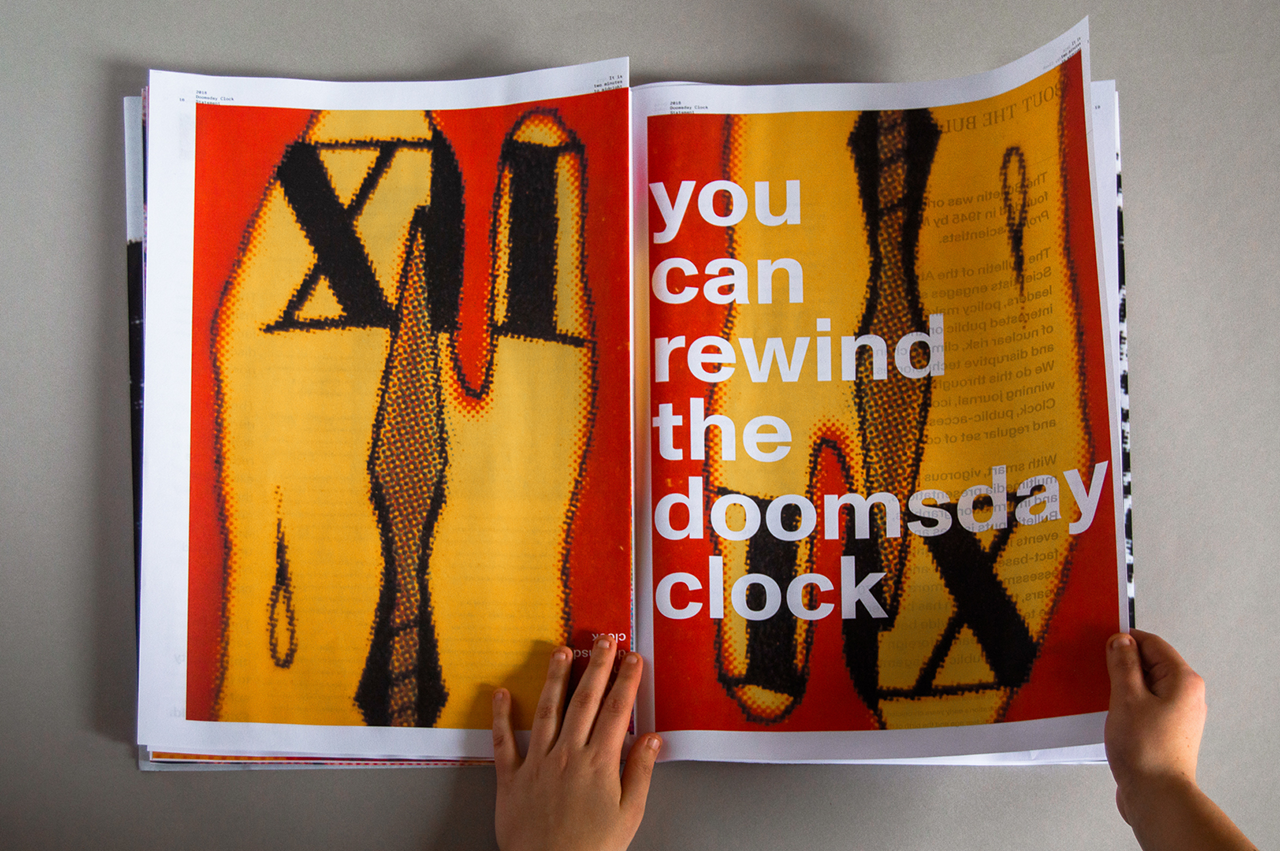
The objective of this project was to refresh the existing annual publication called the » Bulletin of the Atomic Scientists. » The Bulletin deals with the subjects of science and global security issues resulting from accelerating technological advances that have negative consequences for humanity.
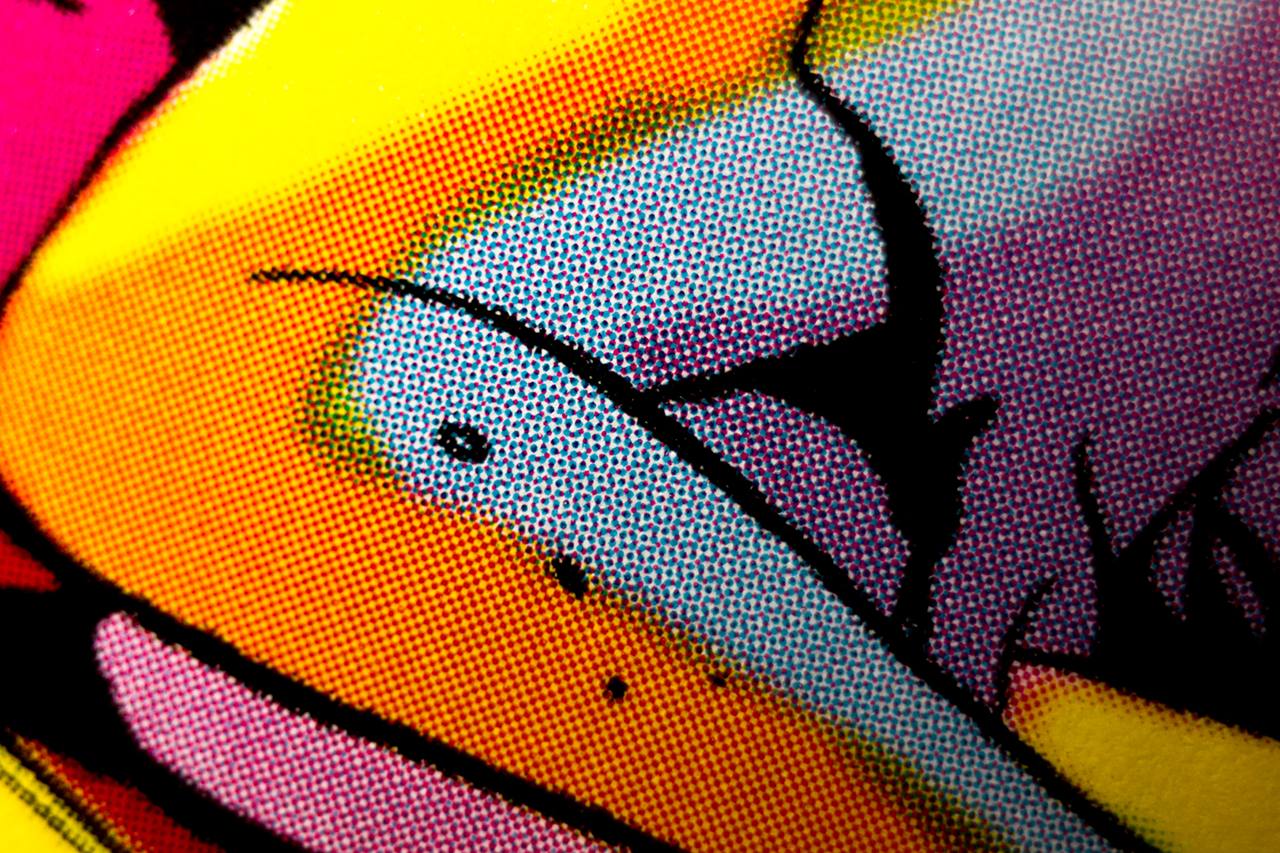
To convey such serious topics, I designed a 10-page folding newspaper with a simple and neat page layout. The main design feature, in order to relay a feeling of hope and positivity, was the use of bright and vivid pictures from the famous Watch Men comic books.
×
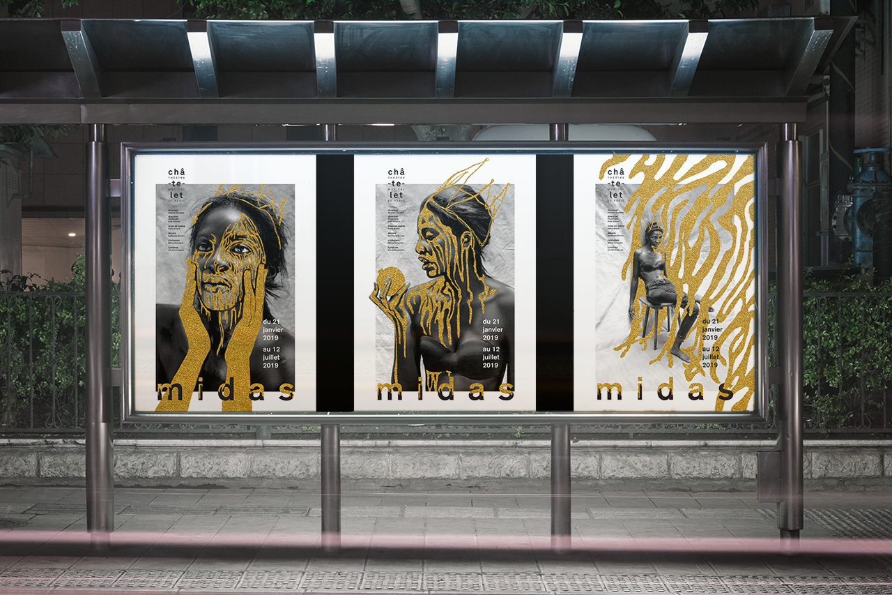
03
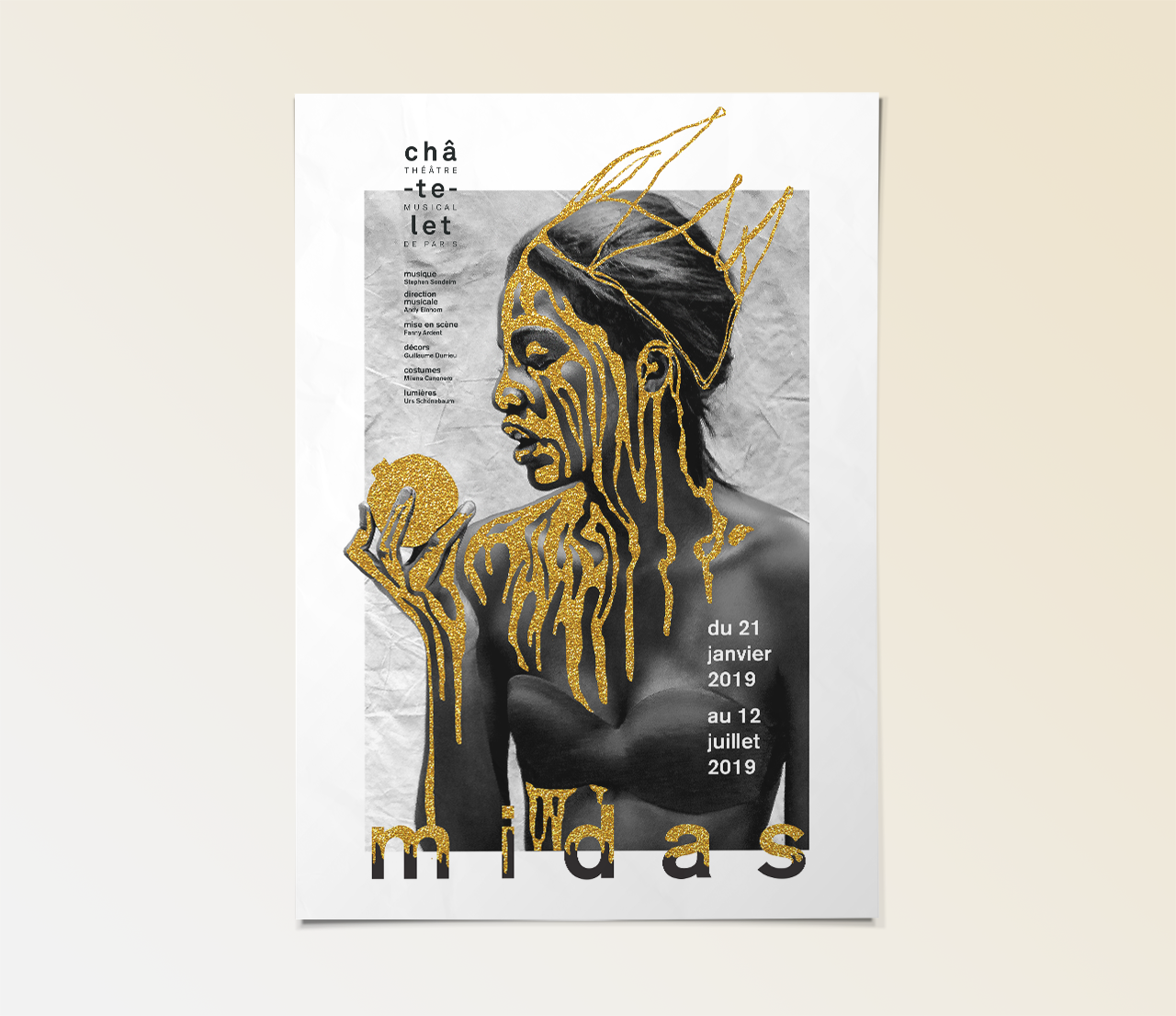
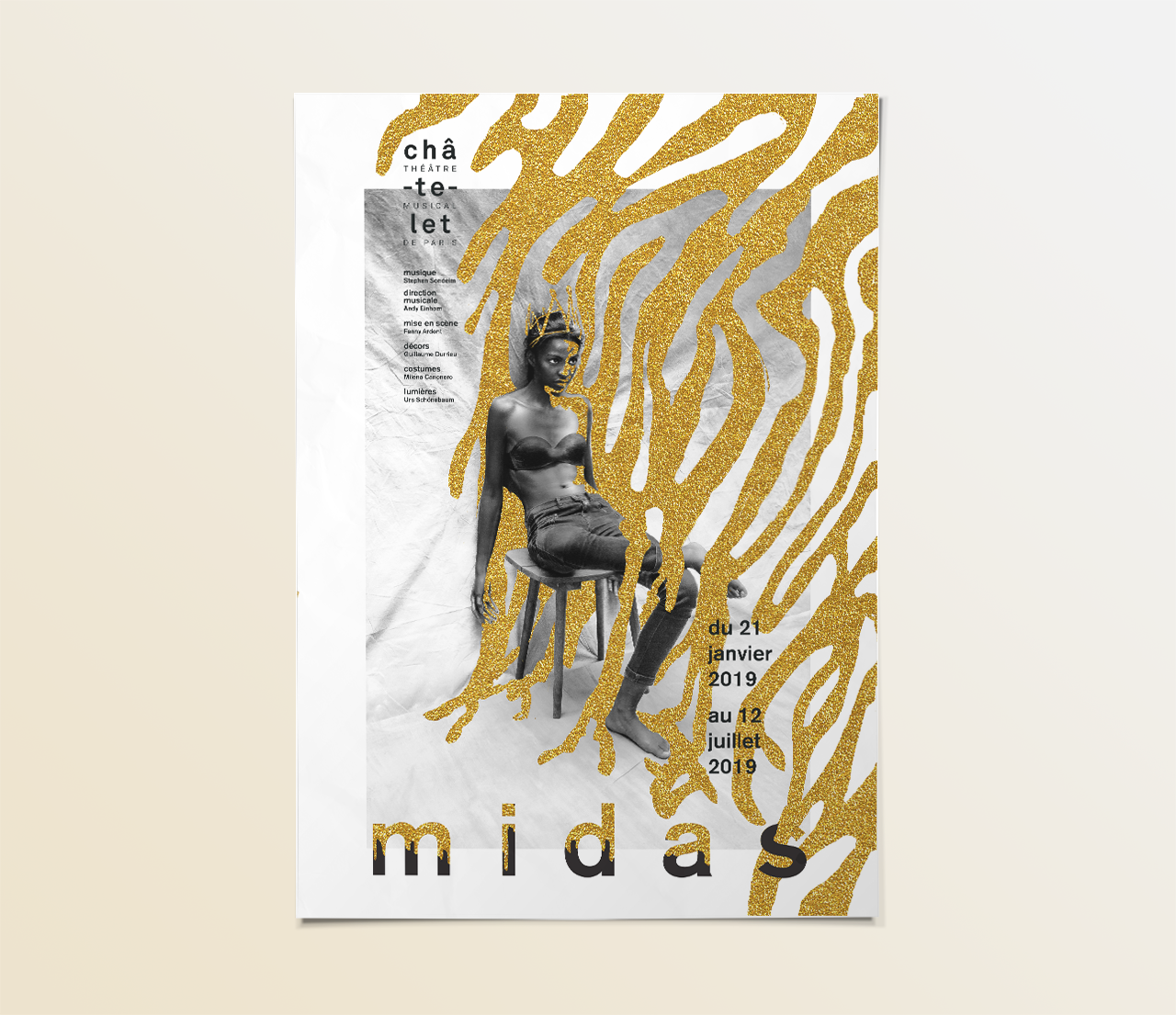
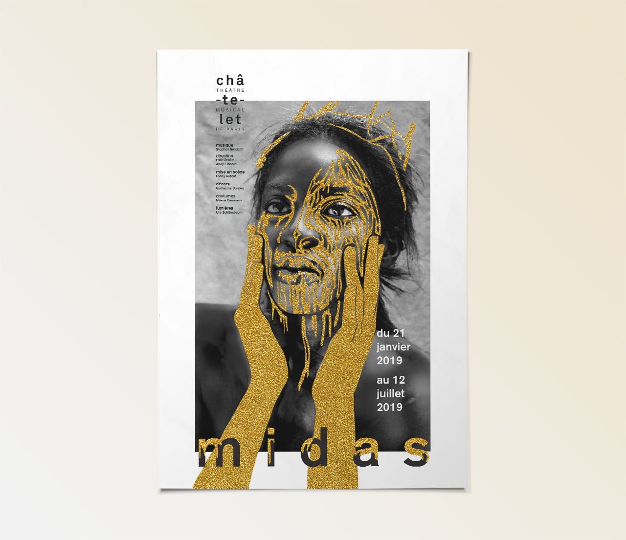
Midas
A series of posters designed for a fictitious theater play called « Midas ». I created the main character, Queen Midas, based on King Midas, popularly remembered in Greek mythology for his ability to turn everything he touched into gold. To visually portray the golden touch, I combined photographic mise-en-scene and digital collage. Gold invades the photographs and slowly transforms Queen Midas into what she craves the most : pure gold. I designed a clean and simple layout in order to balance the posters, between a touch of gold and modernity.
×
04
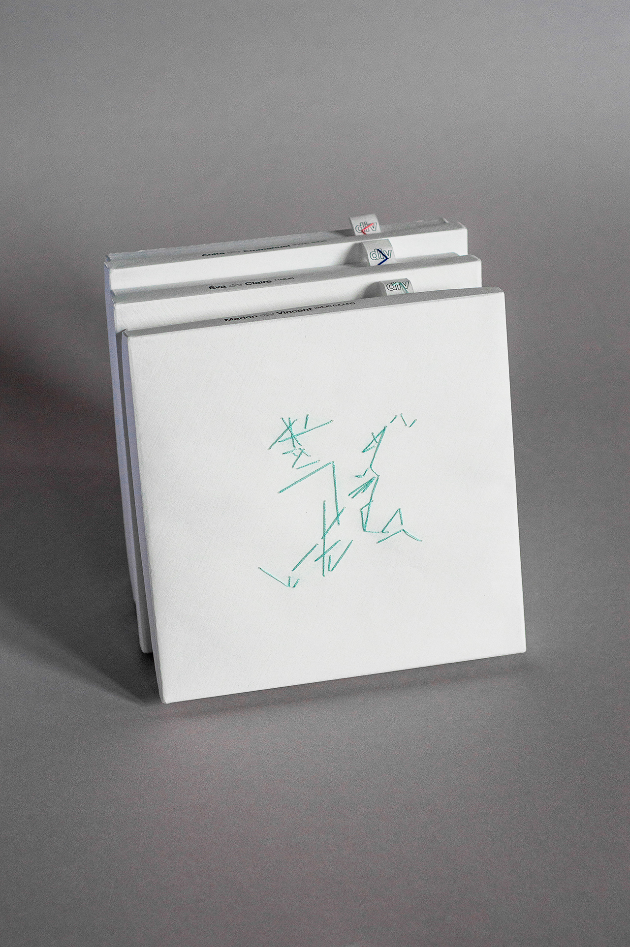
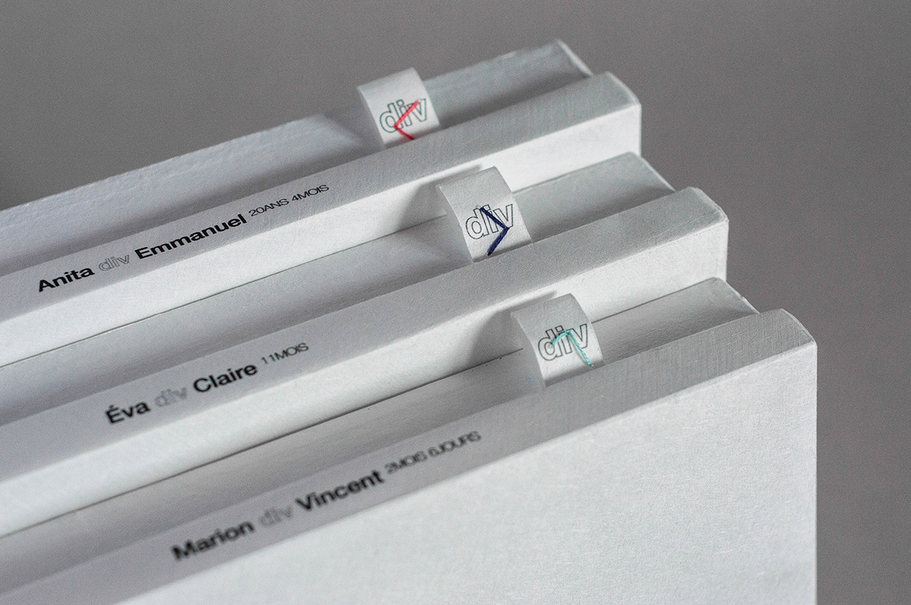
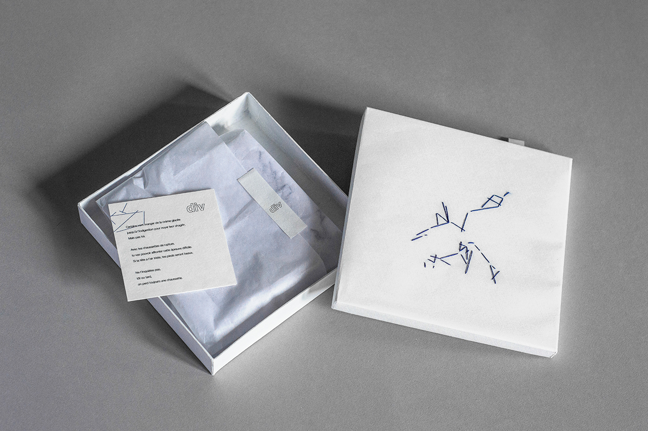
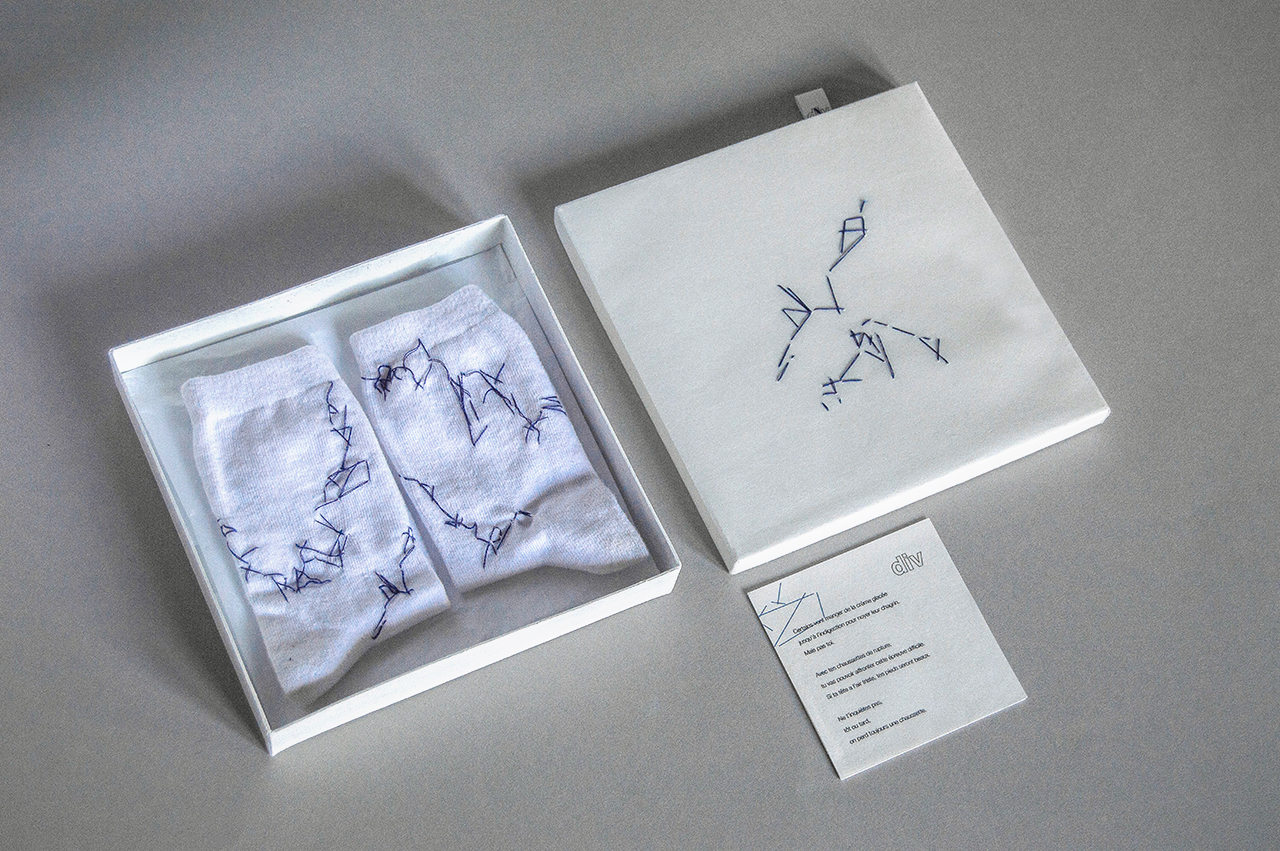
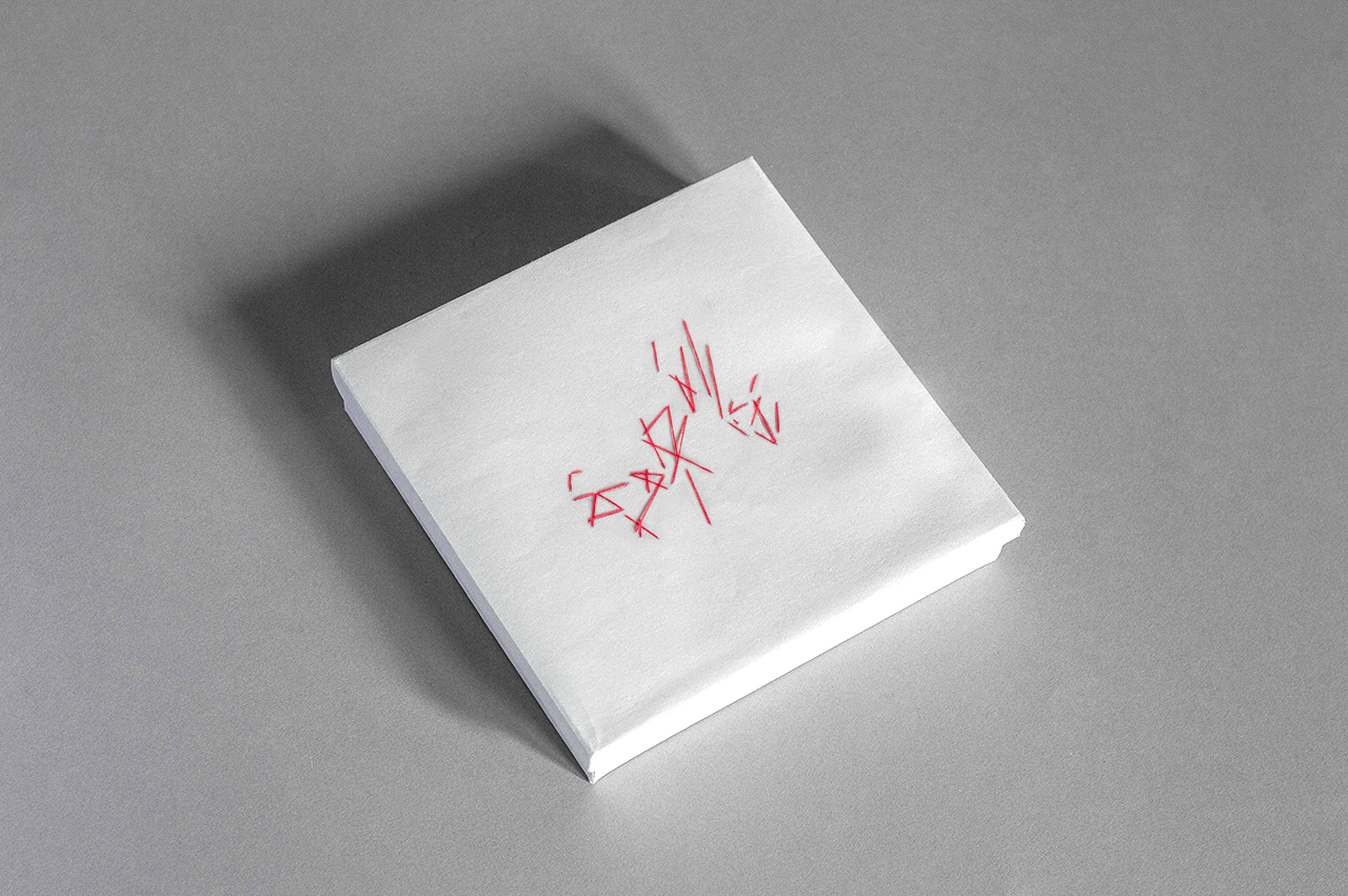
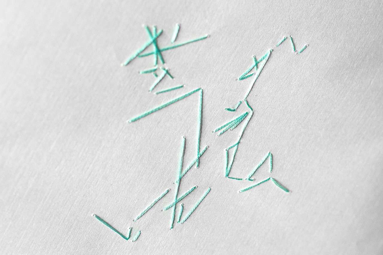
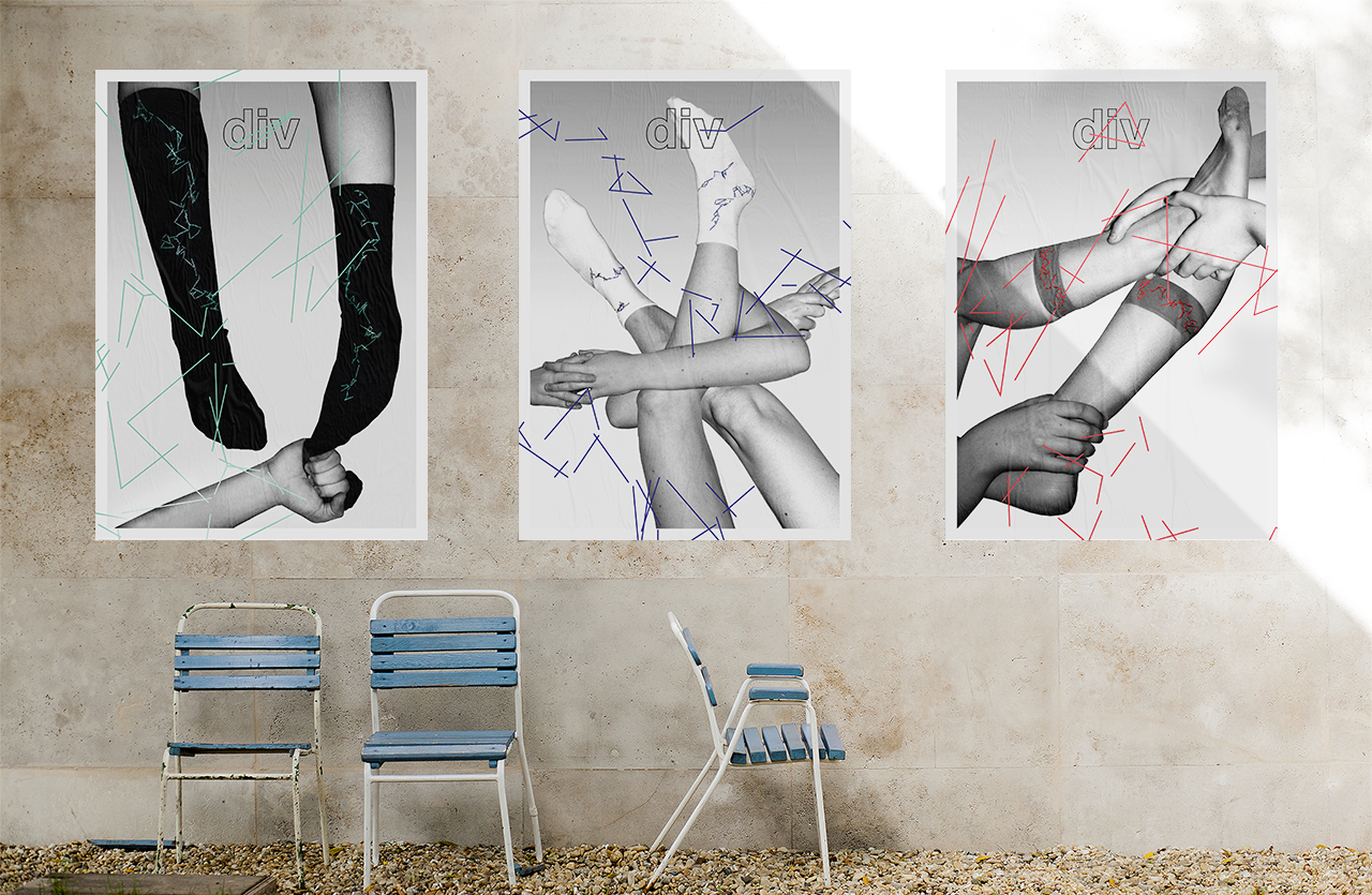
DIV
Creation of a fashion brand designing custom-made pairs of socks, helping you deal with a romantic break-up. The design concept is based on distorted typography, transforming a common break-up sentence into an unreadable linear pattern.
The socks come in three different style, but every pair is unique : as the pattern is implemented on the socks, packaging, poster and based on individual settings such as the names of the ex-partners and the duration of their relationship. Div stands for division, in order to get over your ex, you’ll lose one sock of the pair.
×
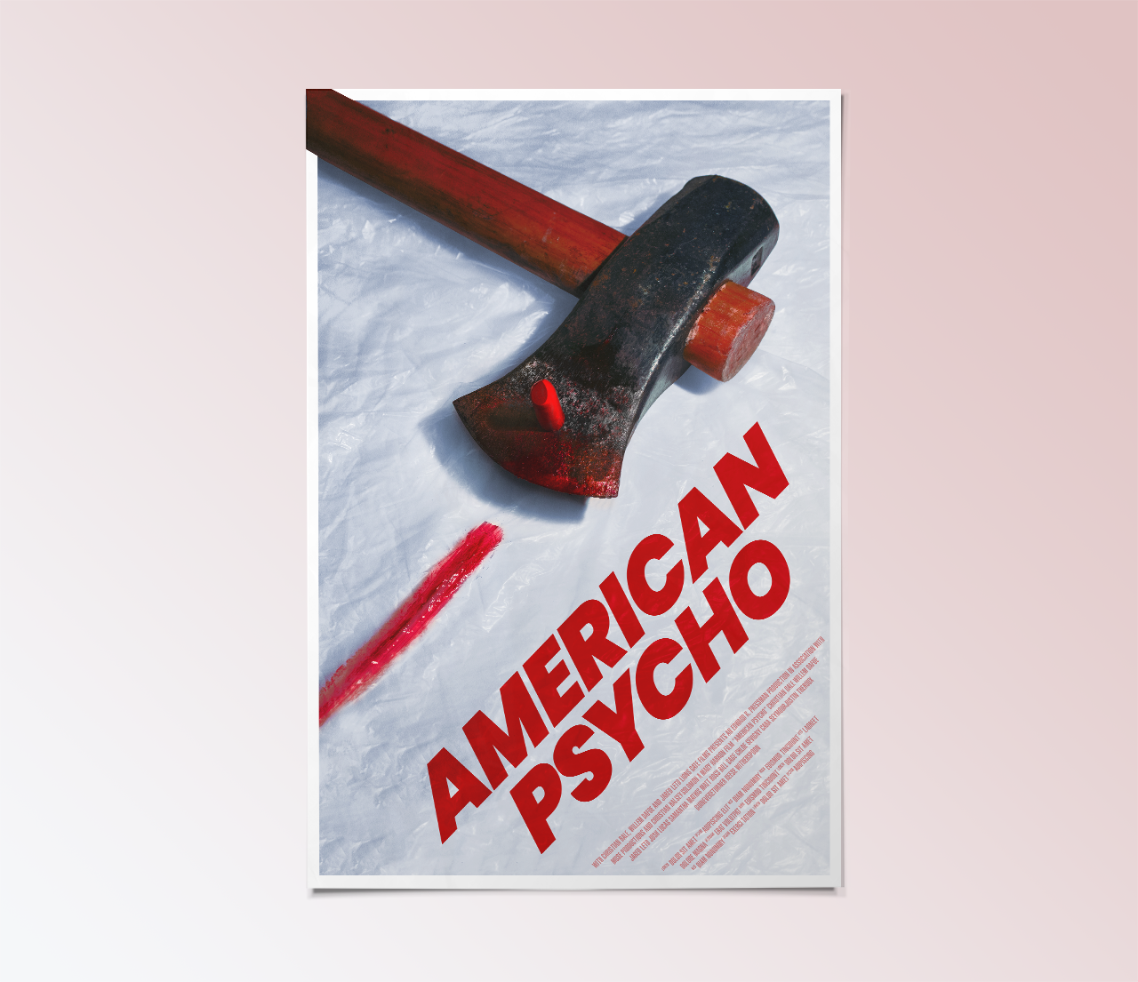
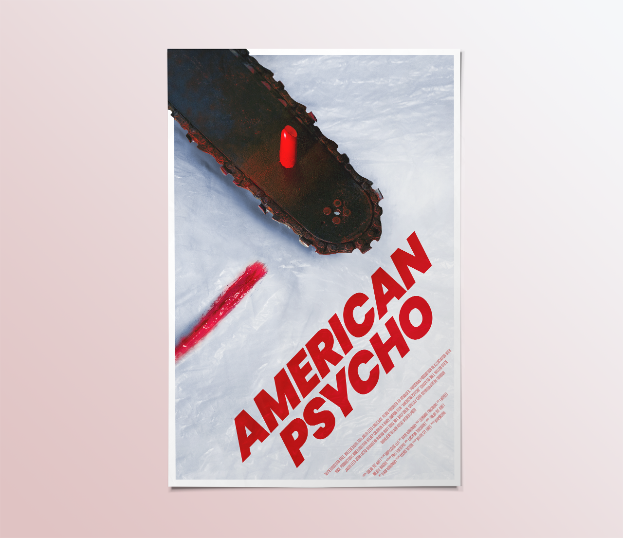
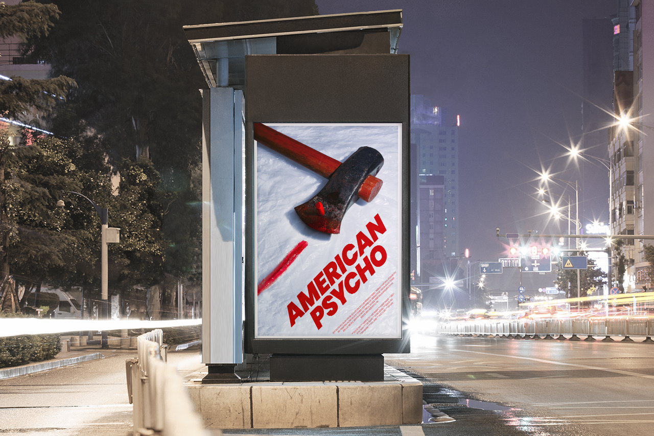
05
American Psycho
A series of movie posters for American Psycho. The key element of the project is the creation of neat still-life, emphasizing on the extreme violence and meticulous cleaning behavior of the main character.
×
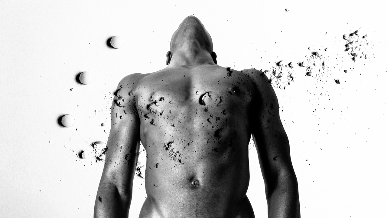
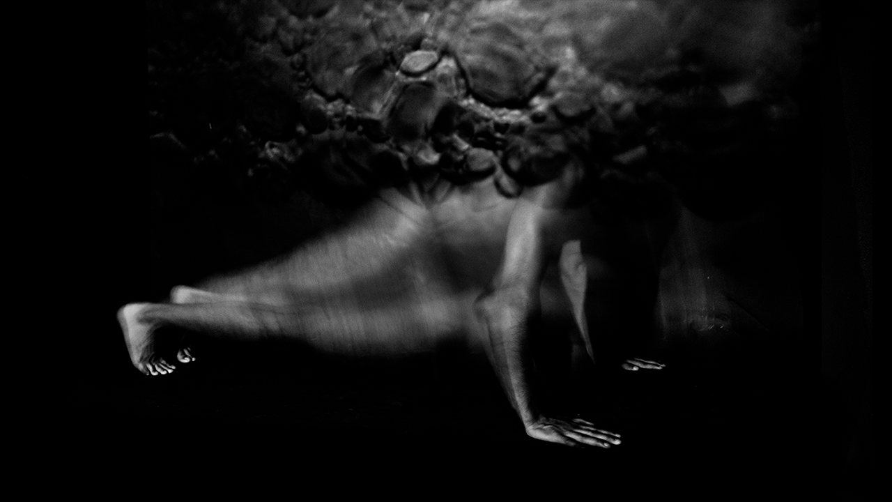
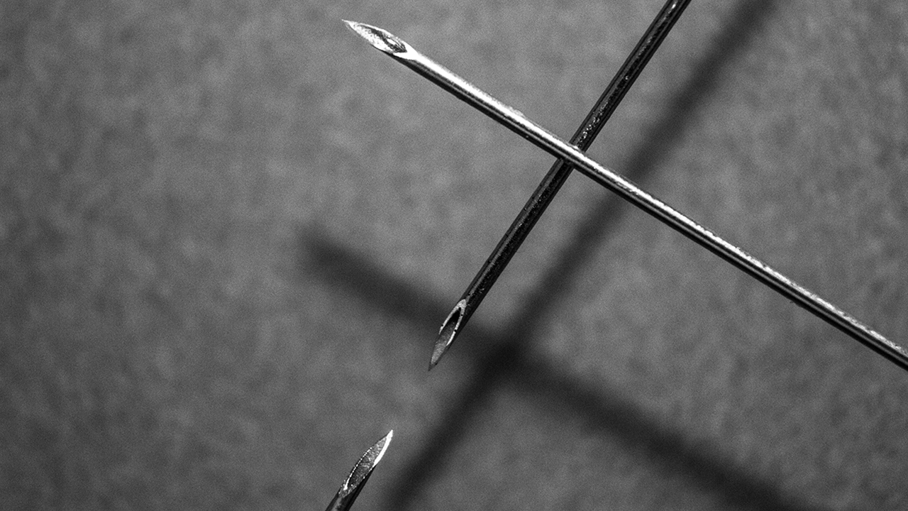
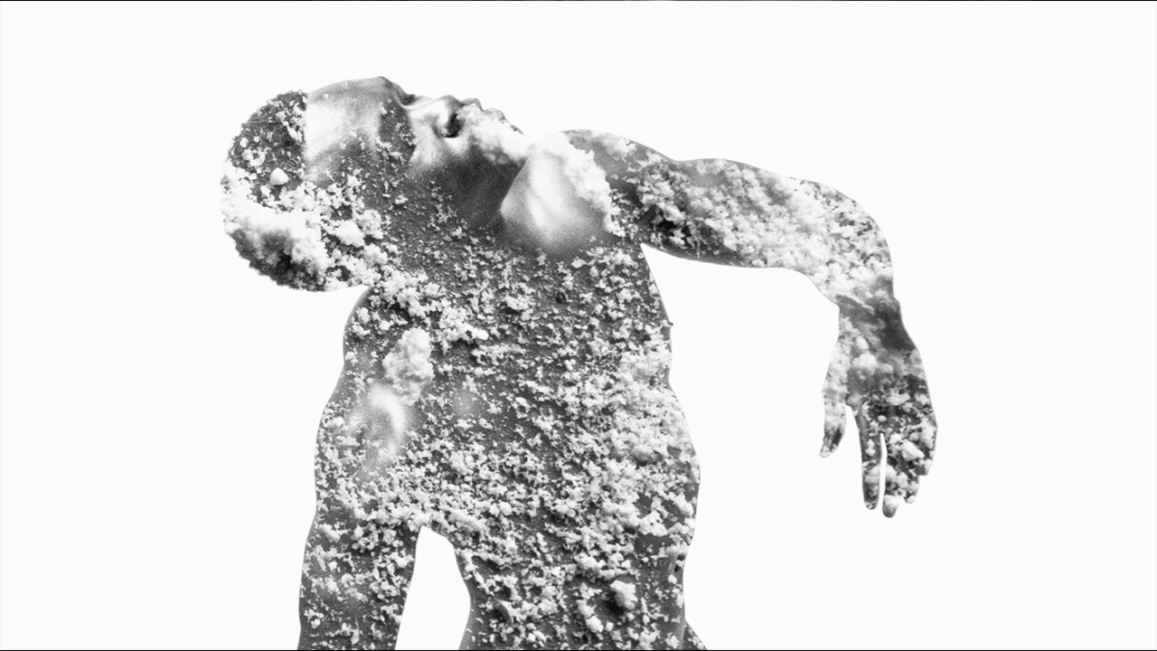
06
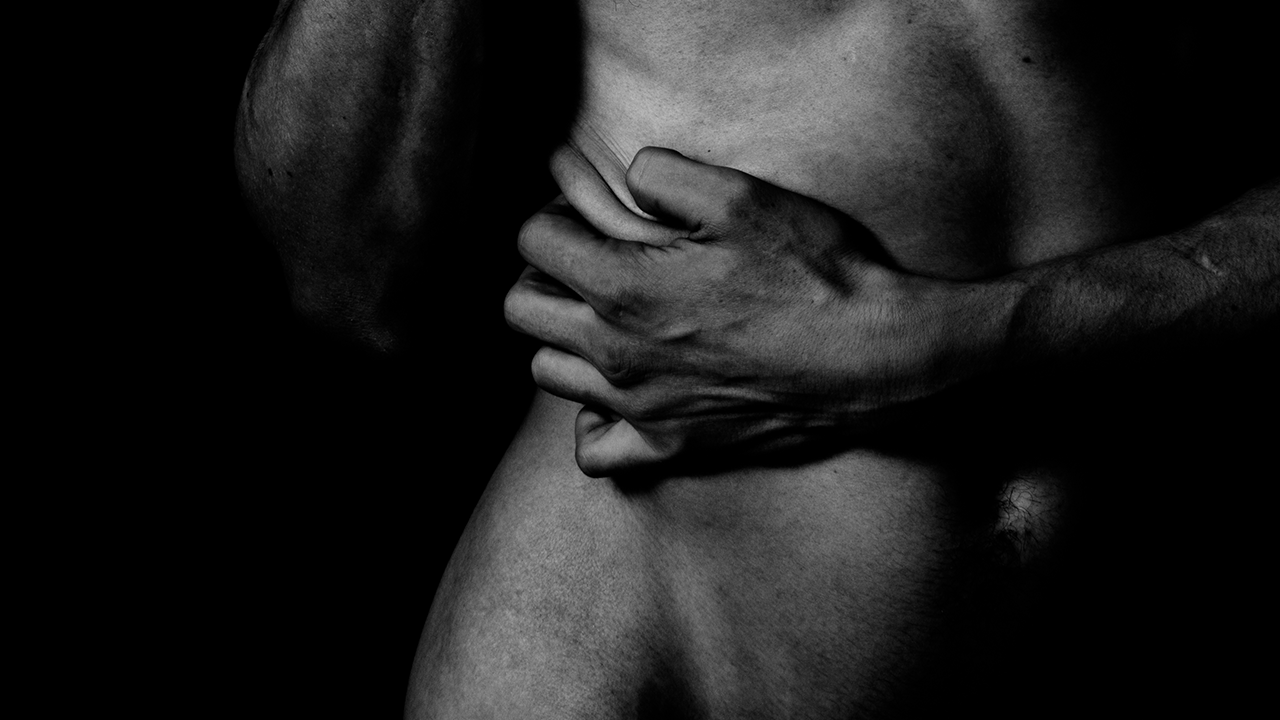
Just Dope It
In the form of an advertising campaign for Nike, the project distorts the brand to raise awareness of doping among professional athletes. The series of black and white photographs are edited in stop motion, following a pulsating rhythm, emphasizing the feelings of performance and suffering.
×
07
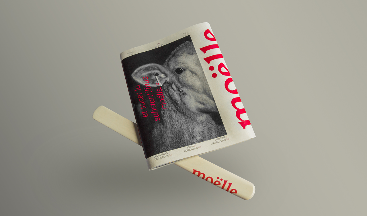
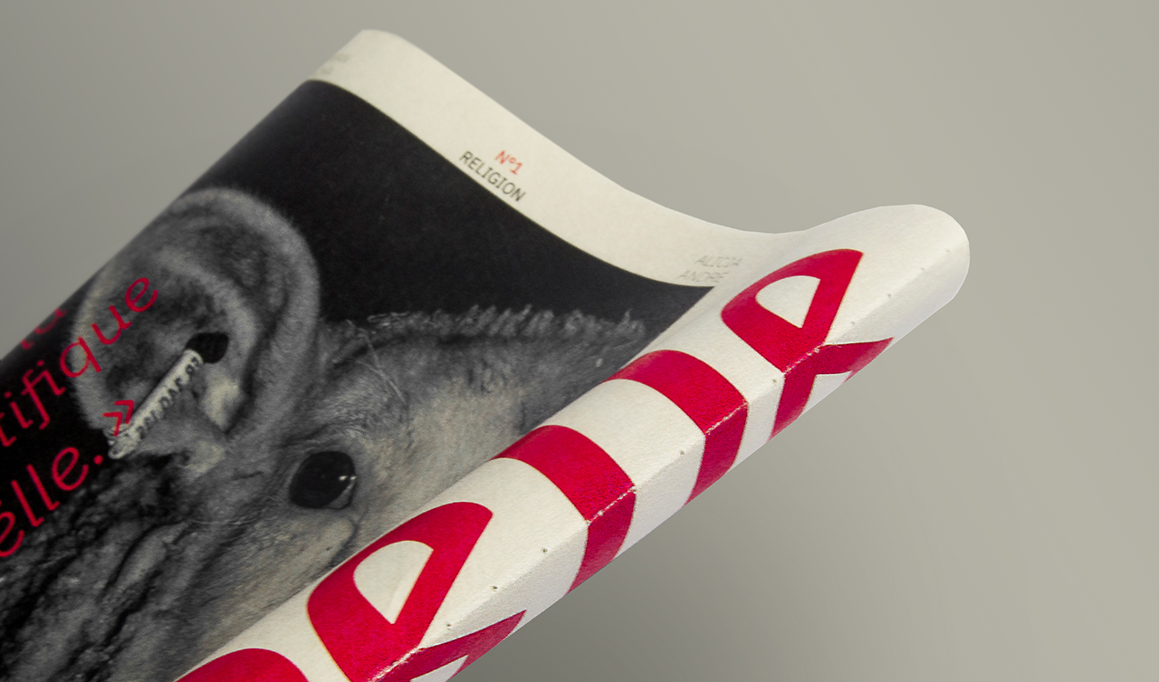
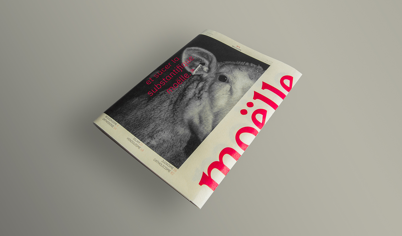
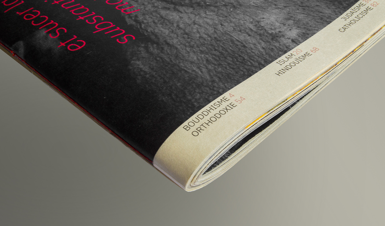
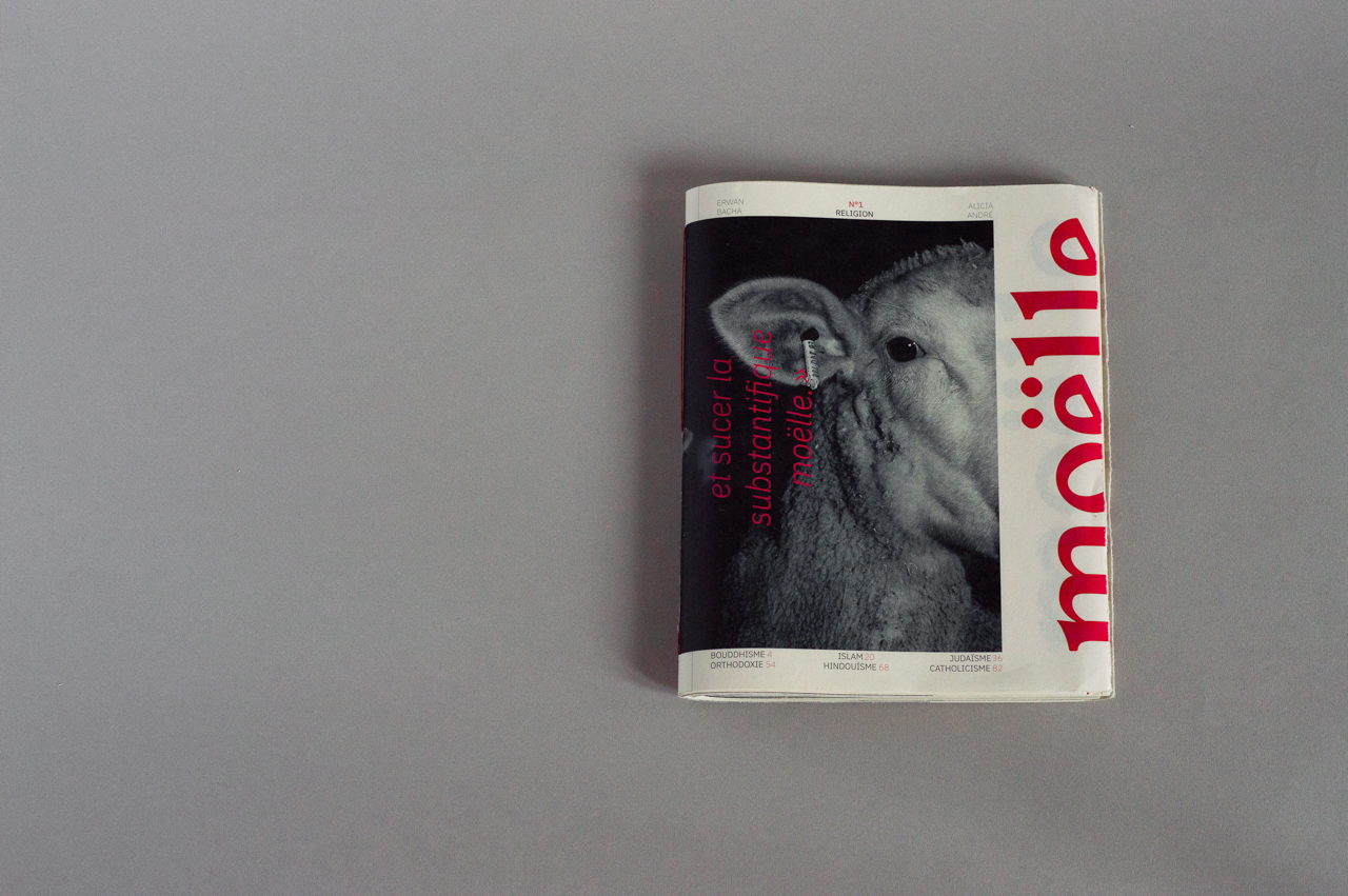
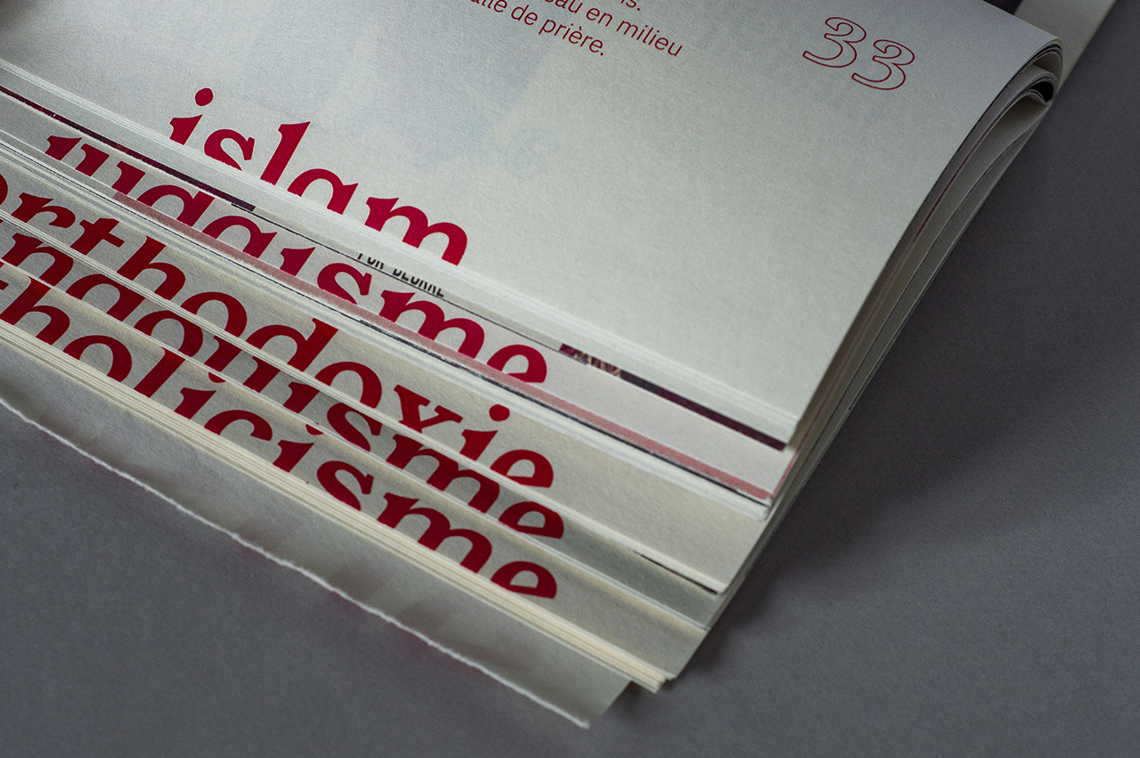
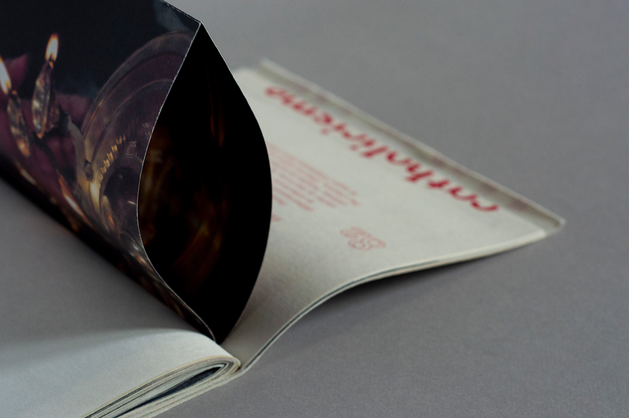
Moëlle
A premium Magazine issue created in collaboration with Erwan Bacha. In a nutshell, the magazine is about food and culinary behaviors in six different religions and cults that can be found in Paris. The main design feature is a complexe page layout we designed including photographs we took of all the places and people we met that helped us during the project.
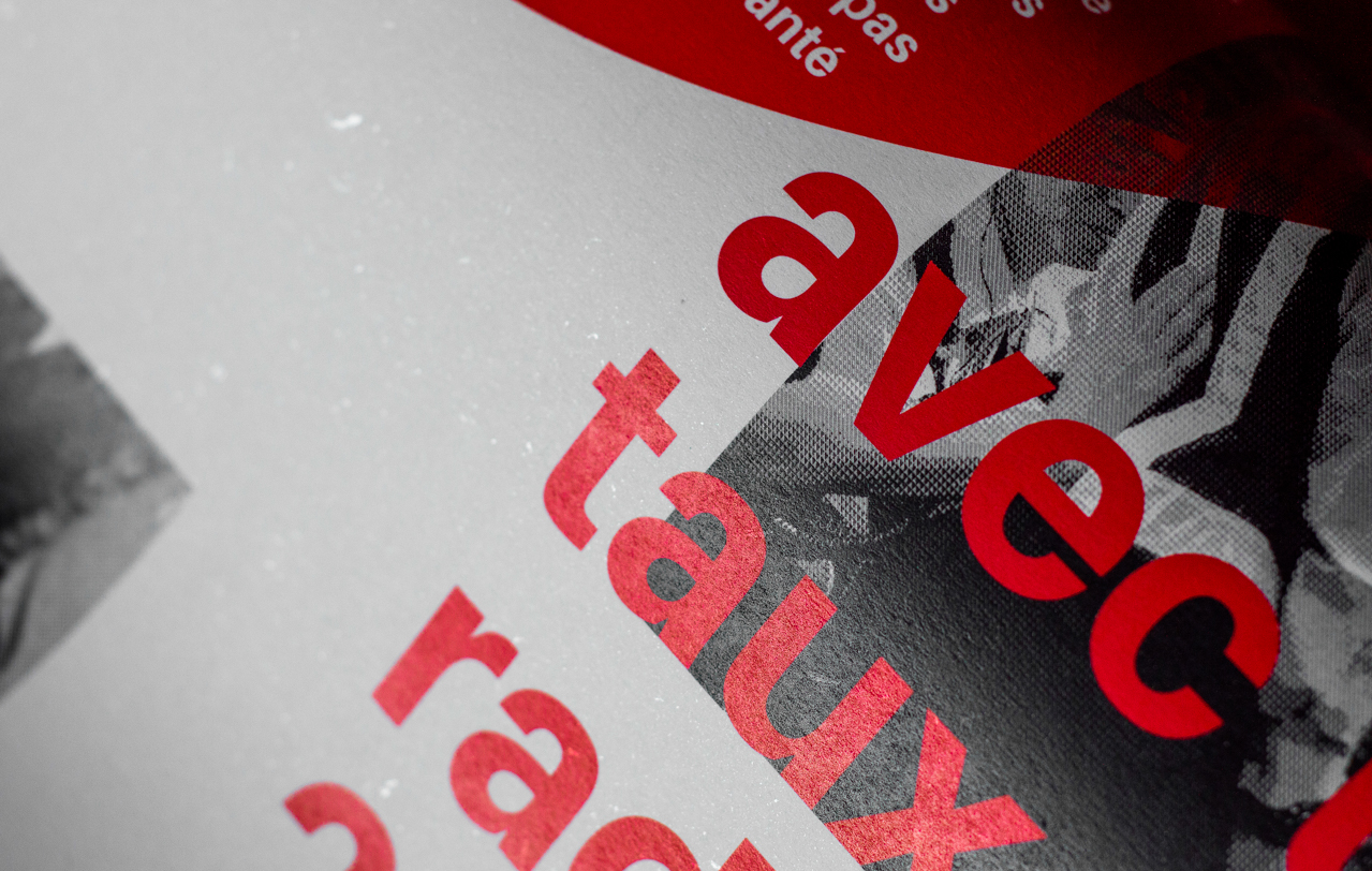
The objective was to promote different cultures, creating a rich and powerful design page layout. The magazine issue can be opened like a box, in keeping with the magazine’s brand guideline, that is based on a famous sentence of Rabelais: «break the bone in order to eat the marrow». The main colour used is red because of its eye catching appeal that recalls blood, life and faith, importants values when we talk about religion.
×
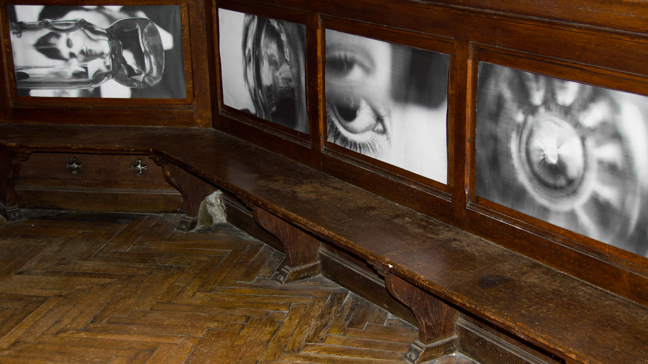
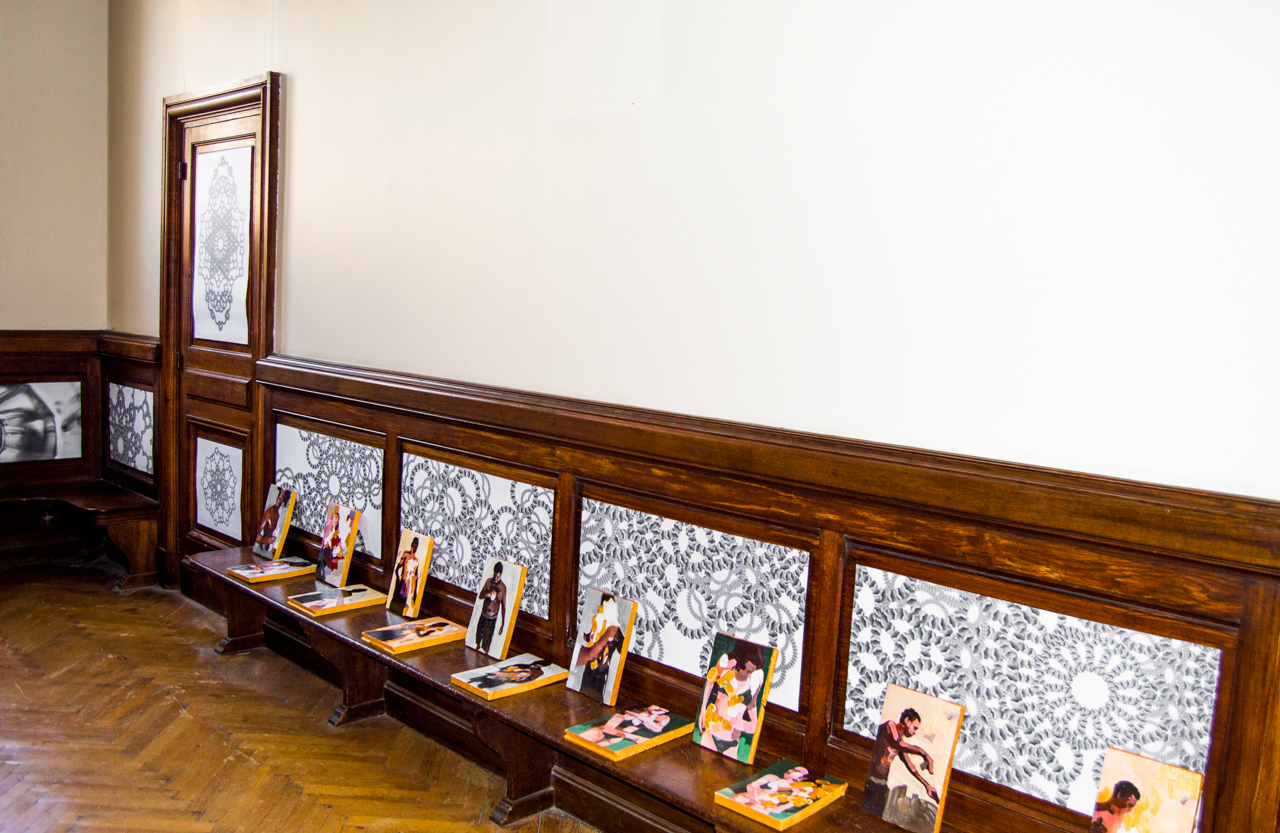
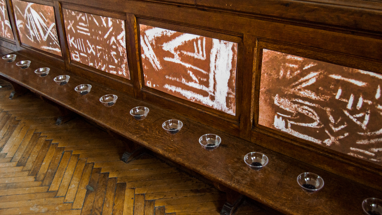
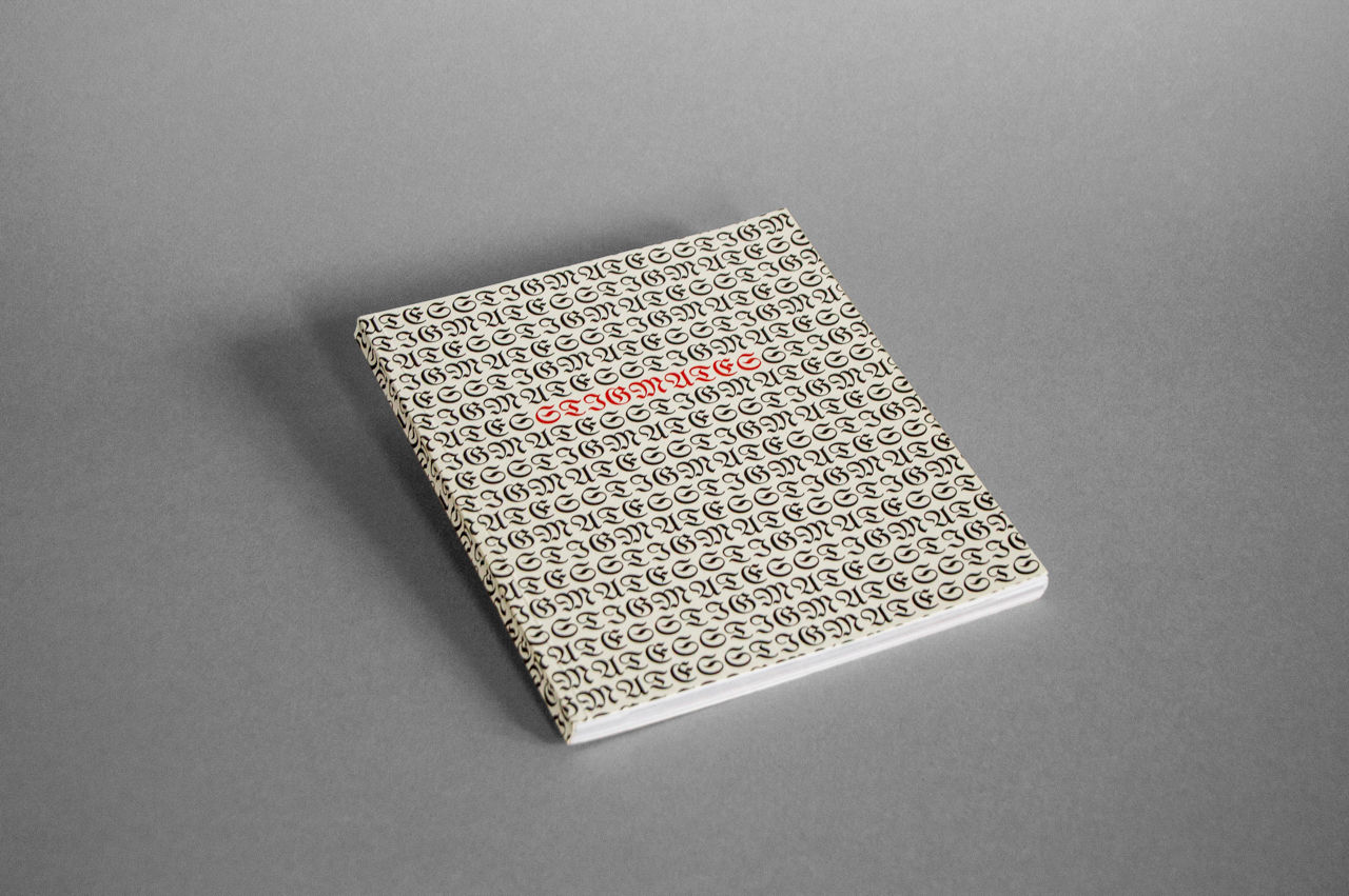
08
Stigmates
A group project based on the theme of internet challenges. We portrayed their absurdity and dangerousness through several projects, displayed in an exhibition. We visually experimented with found-footage on the web and objects related to the challenges, in the form of 3D videos, paintings, installations, printed materials …
×
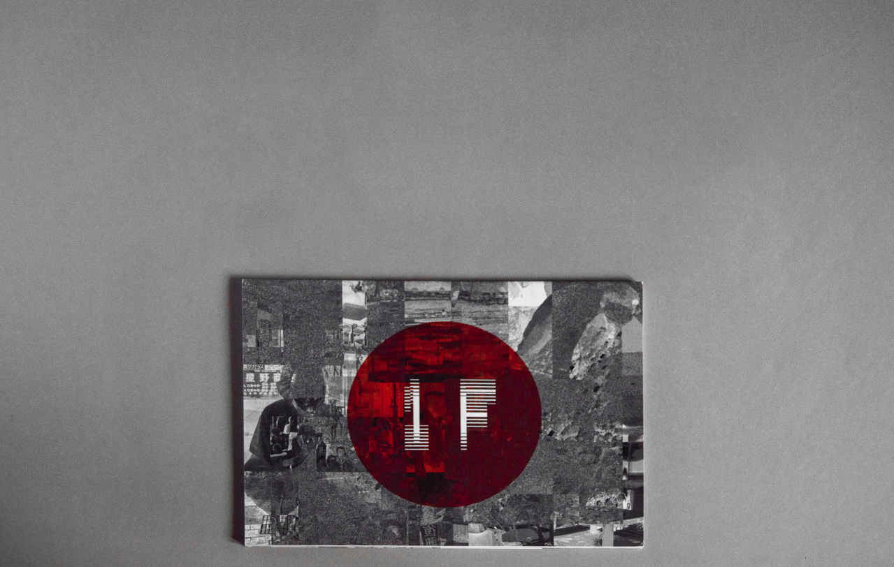
09
1F
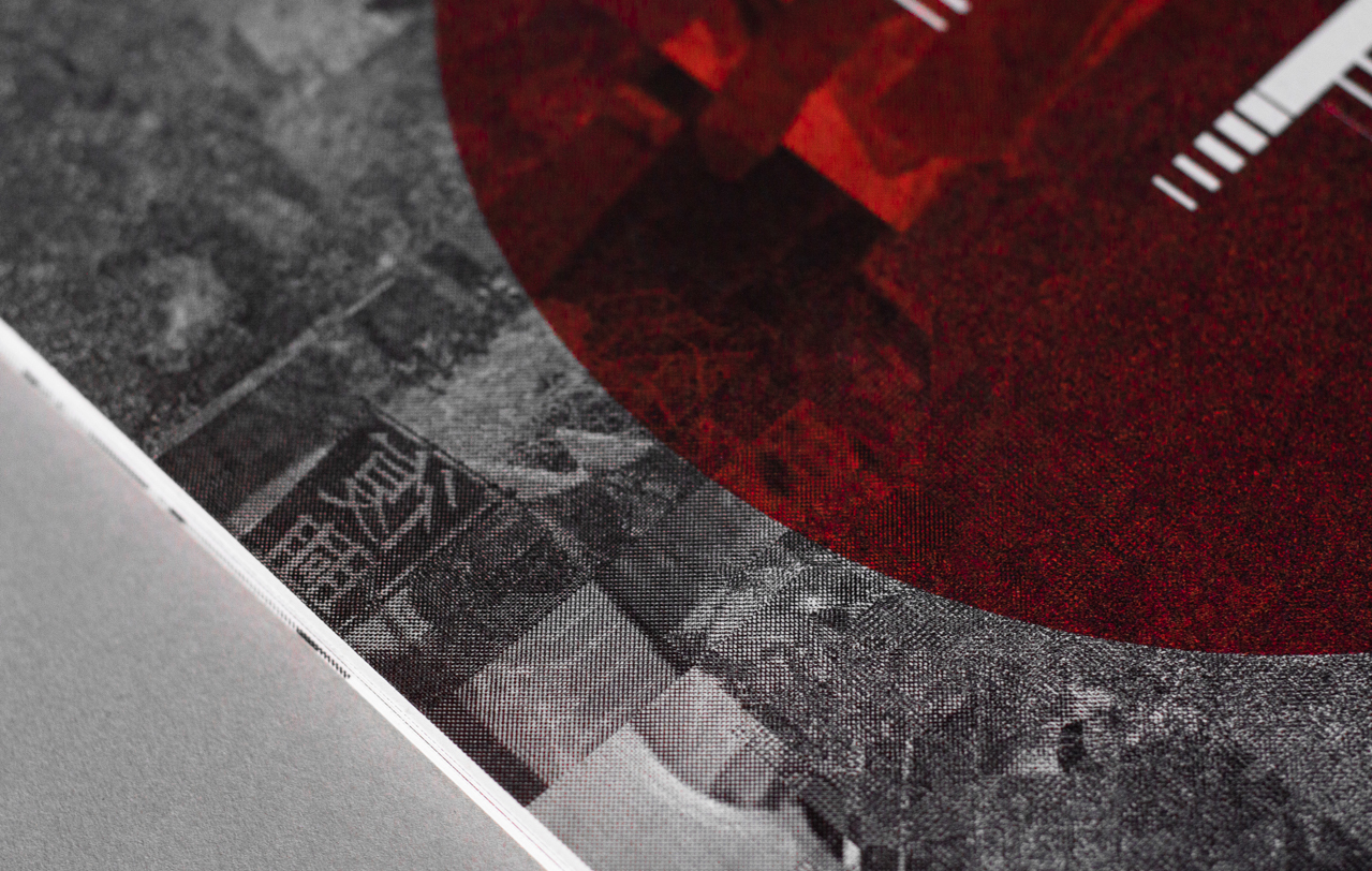
This project is called 1F : the abbreviation of Fukushima daiichi. Following a major earthquake, a 15-metre tsunami disabled the power supply and cooling of three Fukushima Daiichireactors, causing a nuclear accident on 11 March 2011.
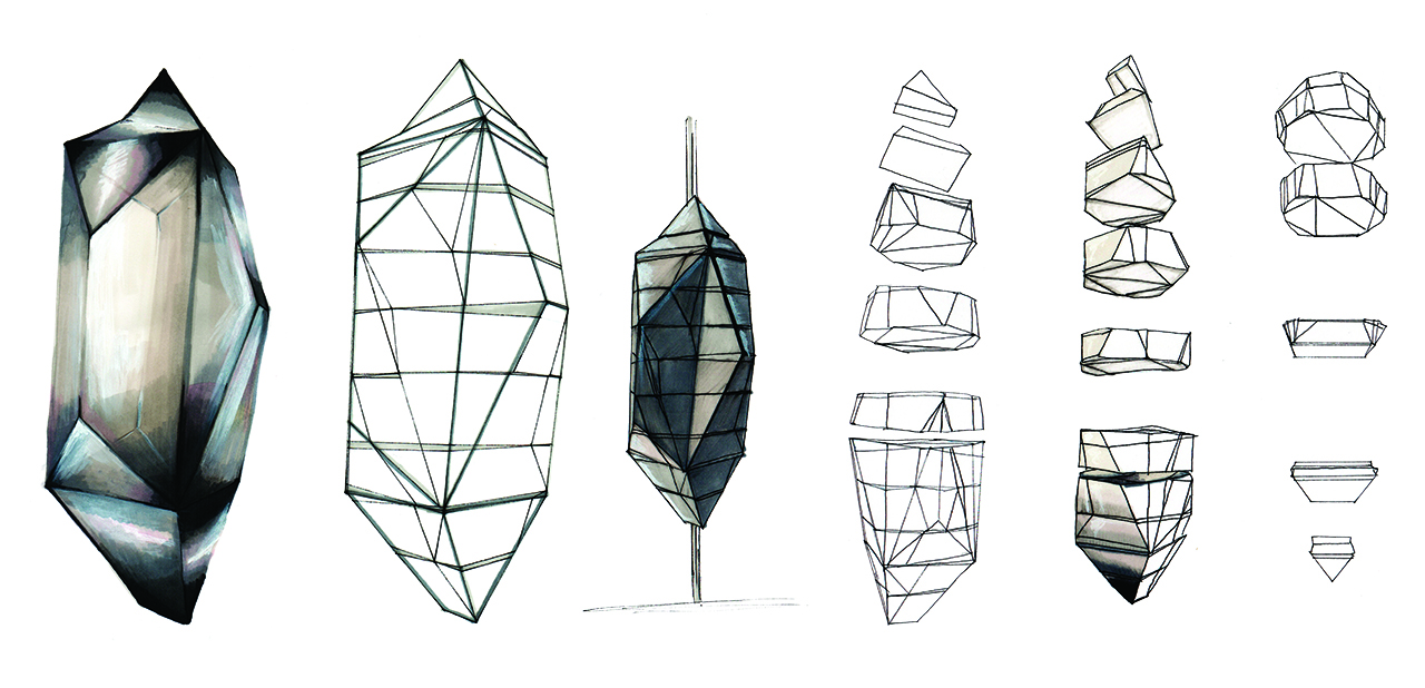
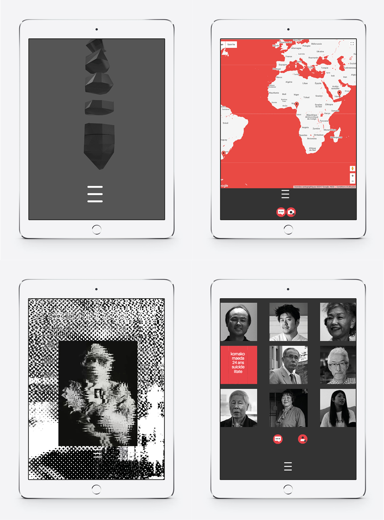
6 years later, what remains of our consciences ? For the most part, it's a miscellaneous news item seen from behind our television, on the other side of the oceans. The main aim of this project is to raise awareness about this disaster and their unknown consequences.In order to do so, the project is made up of an editorial object and an experimental design project called the cenotaph of Fukushima. Inspired by tabloid layout, I gather in this book 6 years of information about the Fukushima nuclear disaster, like clippings organized and illustrated, providing a bigger picture of the event. The use of bitmap pictures and large areas of red, evoking the Japanese flag, creates a powerful feeling about the catastrophy.
The cenotaph of Fukushima is a volume - manifest of a disaster that can not be seen. Separated into 10 parts, the cenotaph is disseminated around the world according to the winds and the ocean currents that brought the contamination of Fukushima. Thanks to an augmented reality application, you can reconstitute the monument in 3D on any devices. A web platform opens up and allows you to access to the map listing the location of different parts of the cenotaph, the list of victims of the nuclear disaster that everyone can update over the years and testimonies of the victims.
×
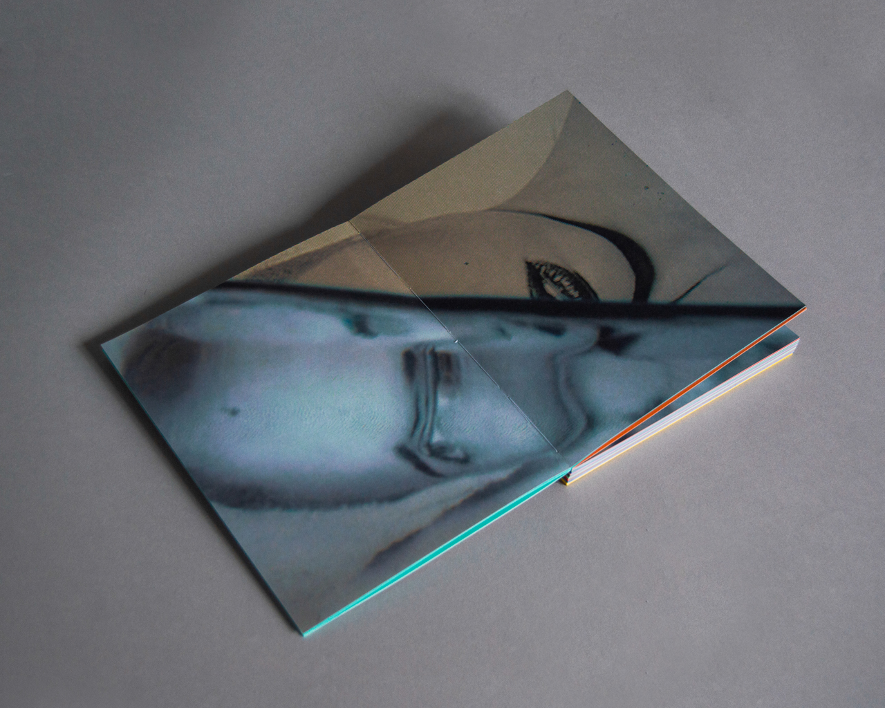
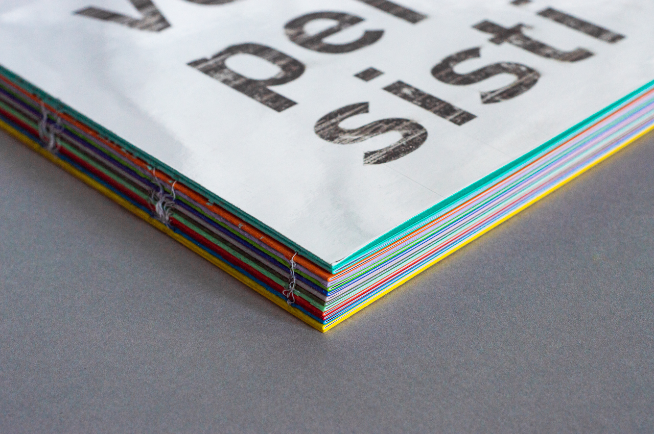
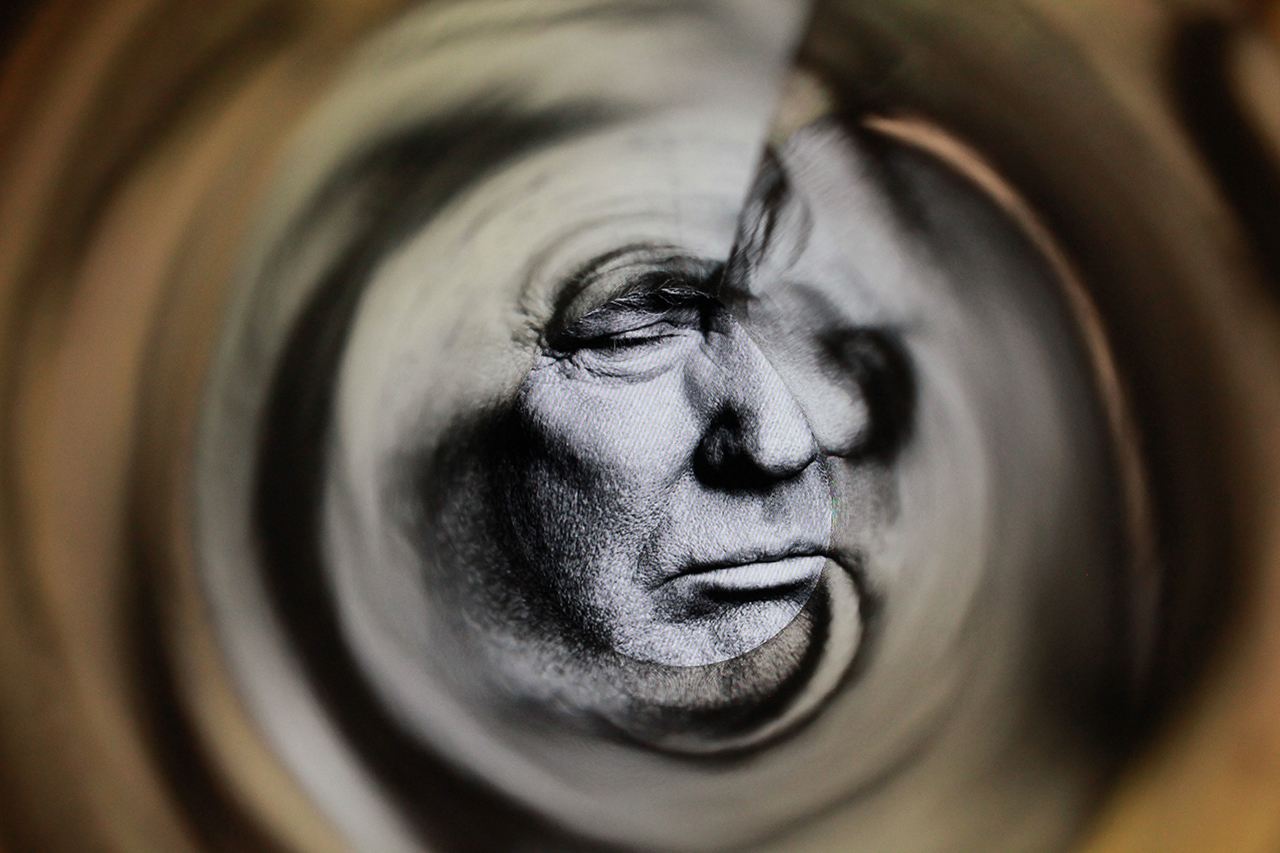
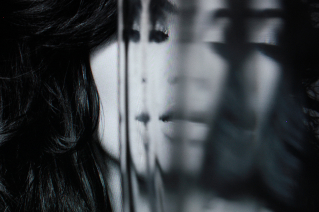
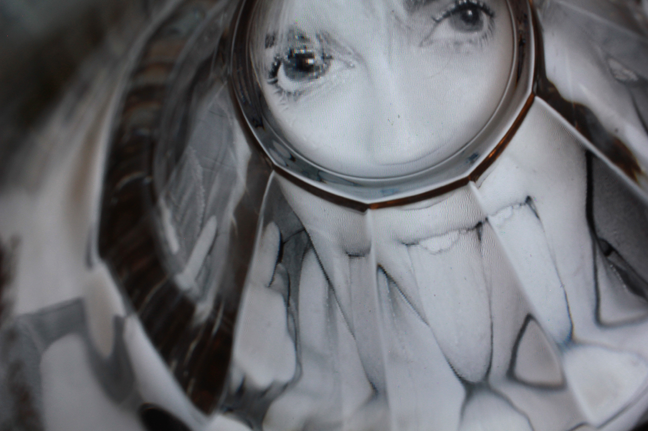
10
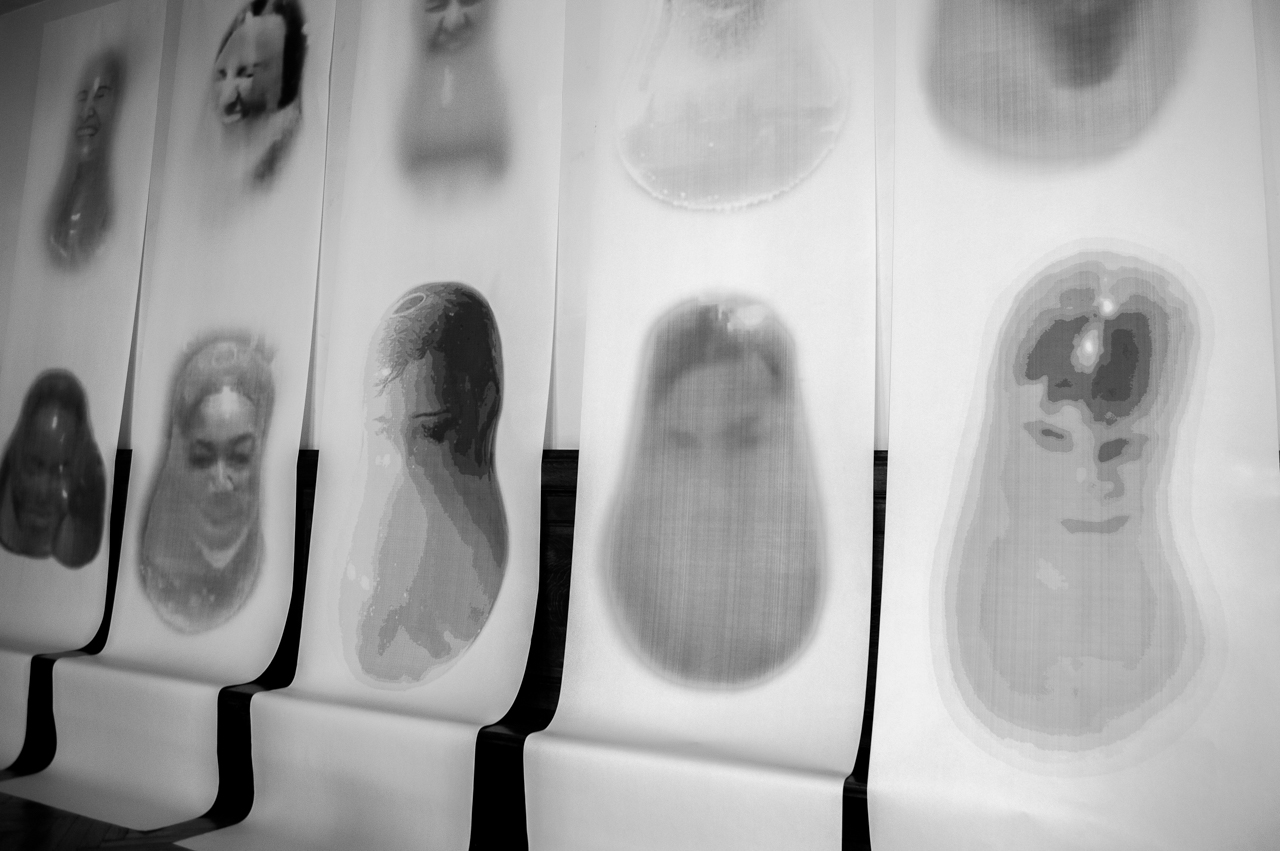
Veni, Veni, Persisti
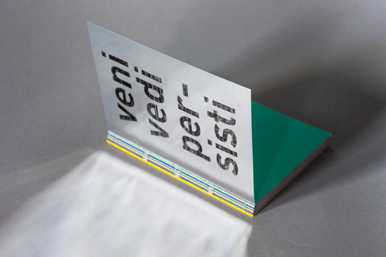
A series of photographs portraying the 10 most hated personalities in 2017 (from the NY Times 2017 ranking), inspired by the optical illusion called persistence of vision. What remains printed on our retina when we close our eyes ? Many things, many people, and especially those personalities that you see everywhere without being able to forget them. Veni, Vedi, Persisti visually represents those people, engraved in our retina, distorted by our own perception.
Alien
Doomday Clock
Midas
DIV
American Psycho
Just Do It
Moëlle
Stigmates
1F
Veni, Vidi, Persisti